 (1)")


 (1)")

organic marketing blog for creatives
I'm sharing all things Website Tips, blogging, and entrepreneurship. Dive in and explore the resources!
MOST POPULAR POSTS
I love using this space to share a touch of website design magic along with my favorite tips. Whether you’re launching your first business or giving your online home a makeover, this is your trusted hub for design inspiration.

must read posts
When it comes to building a website that doesn’t just look pretty but actually converts visitors into clients, design isn’t enough. Every page on your Showit site needs to be intentional, guiding your audience through a seamless journey that builds trust and inspires action.
So, what does that look like in practice? Let’s break down the anatomy of a high-converting Showit website—page by page.

1. Homepage: The First Impression That Hooks
Your homepage should clearly communicate who you are, who you help, and what you offer. Within the first 5 seconds, visitors should understand:
- What problem you solve
- Who you solve it for
- How they can take the next step
✨ Pro Tip: Use a bold, benefit-driven headline and a clear call-to-action button above the fold (before scrolling).
2. About Page: Connection Over Credentials
Clients don’t just buy services—they buy into you. Your About Page should go beyond a resume-style bio. Share your story, highlight your values, and show why you care.
- Use storytelling to humanize your brand
- Include a photo or video for personal connection
- Add social proof (testimonials, features, or stats)
3. Services Page: Clarity Converts
This is where you guide your visitor into understanding exactly what you offer and why it matters. Keep it simple, clear, and results-driven.
- Break down your offers into packages or tiers
- Highlight benefits (not just features)
- Add FAQs to remove hesitation
4. Portfolio or Case Studies: Proof of Transformation
Results speak louder than words. A portfolio or case study section shows potential clients the outcome they can expect.
- Use before/after transformations
- Include client testimonials with names/photos if possible
- Share process highlights to show credibility
5. Blog: Authority + SEO Power
Your blog isn’t just for writing—it’s a trust-building tool. Regular content builds authority in your niche and drives organic traffic to your site.
- Write educational, problem-solving posts
- End each post with a call-to-action (newsletter signup, service inquiry, etc.)
- Repurpose blog content for social media to expand reach
6. Contact Page: Keep It Friction-Free
The easier it is to connect with you, the more inquiries you’ll receive. Your contact page should feel warm, inviting, and simple.
- Use a clean contact form with minimal fields
- Offer multiple touchpoints (form + email + social links)
- Set expectations on response times
7. Calls-to-Action: Guiding the Journey
Sprinkle CTAs throughout your site—not just on the homepage. Every page should give your visitor a next step: book a call, download a freebie, join your email list, etc.
✨ Pro Tip: Keep your CTAs consistent so visitors always know how to take action.
Final Thoughts
The beauty of Showit is its design freedom—but strategy is what transforms a beautiful website into a high-converting one. By structuring your site with intention, you’ll not only attract the right audience but also guide them naturally into becoming paying clients.
👉 Don’t want to do your own website and need help? We got you.
READ FULL POST!

must read posts
Building a beautiful Showit website is one thing. But building a Showit website that actually converts visitors into clients? That’s a whole different game.
If you’re a coach, consultant, or creative entrepreneur, your website isn’t just a digital business card—it’s a sales machine. And the way you structure each page makes all the difference.
Here are the 7 must-have sections you should never skip if you want your Showit site to work as hard as you do.

1. The Hero Section That Hooks Instantly
Your hero section is prime real estate. Within 3 seconds, your visitor should know:
- Who you are
- What you offer
- Why they should stay
Think bold headline, subtext that connects, and one strong call-to-action button.
2. The “About You” Snapshot
This isn’t your full bio. It’s a short, approachable introduction that builds trust. Share your mission, why you do what you do, and how you help people.
3. The Services Overview
Don’t bury the good stuff. Highlight your core services upfront with simple descriptions, pricing (if you want), and a clear path to learn more.
4. Social Proof & Testimonials
People buy because of trust. Adding client reviews, transformation stories, or logos of brands you’ve worked with makes your services instantly more credible.
5. A Clear Process Section
Break down your process into 3–5 easy steps. Show how working with you is straightforward and results-driven. Visitors love seeing a clear roadmap.
6. Lead Magnet / Freebie Section
Not everyone is ready to hire you on the spot. Give them an easy “yes” with a free guide, checklist, or resource that gets them onto your email list.
7. A Strong Closing Call-to-Action
Your page should never just fizzle out. End with one more chance to book a call, sign up, or connect. Use confident, action-oriented copy like:
👉 “Let’s start your transformation today.”
✨ Final Thoughts
A high-converting Showit page isn’t about being flashy—it’s about being strategic. With these 7 sections in place, your site will guide visitors naturally from curious to committed.
Don’t want to spend weeks figuring this out on your own? Need a Showit website that looks stunning and sells for you? We’ve got you covered. 🚀
READ FULL POST!

must read posts
When I first started building my website on Showit, I was so excited about the endless design freedom. Finally—a platform where I didn’t have to touch code or stick to boring templates. But… that excitement quickly turned into overwhelm.
I spent hours dragging, dropping, and redesigning—only to realize later that I made some big mistakes that cost me time, energy, and even potential clients.
So, to save you from the same headaches, here are the biggest Showit setup mistakes I made—and how you can avoid them.

1. Focusing Too Much on “Pretty” Instead of Strategy
I was obsessed with fonts, colors, and layouts. But I forgot the main purpose of a website: to guide visitors into taking action.
💡 Lesson learned: A beautiful website means nothing if it doesn’t convert. Start with strategy → then design.
2. Ignoring Mobile Design
I perfected my desktop site… then looked at my phone and nearly cried. 🤦 Showit lets you design mobile separately, but I didn’t use that feature early on.
💡 Lesson learned: Always design for mobile first—because that’s where most visitors are.
3. Skipping the Copywriting Part
I kept tweaking visuals but left my copy as filler text. Big mistake. Copy is what sells—not just the design.
💡 Lesson learned: Invest time in writing clear, client-focused copy that speaks to your audience.
4. Forgetting About SEO
I thought SEO didn’t matter because “I’ll just share my site on Instagram.” Nope. Without titles, descriptions, and blog content, my site was basically invisible to Google.
💡 Lesson learned: Use Showit’s WordPress integration to blog and set up your SEO basics from day one.
5. Overcomplicating the Menu + Pages
I built too many pages—thinking I needed one for every tiny detail. Visitors just got lost.
💡 Lesson learned: Keep your navigation simple. A clear journey converts way better than 10 random pages.
6. Not Embedding My Booking/Payment Tools
For months, I had people emailing me to book. It took forever to go back and forth with scheduling.
💡 Lesson learned: Embed tools like Calendly, Acuity, or PayPal directly into your Showit site. Make booking seamless.
7. Waiting Too Long to Launch
I kept tweaking, second-guessing, and redesigning—thinking it wasn’t “perfect” yet. Meanwhile, I was losing clients.
💡 Lesson learned: Done is better than perfect. Launch now, refine later.
Conclusion:
Looking back, I wish I had known these mistakes before I built my first Showit site—it would’ve saved me weeks of frustration. But here’s the good news: once I fixed them, my site not only looked better, it started converting.
👉 In my next post, I’ll share the exact Showit setup checklist I now use for every website—so you can skip the trial-and-error and get it right the first time.
READ FULL POST!

must read posts
Let’s be honest—having a pretty website doesn’t always mean you’ll book more clients. You can have gorgeous colors, fonts, and layouts… but if your site isn’t strategically designed to convert, you’re basically leaving money on the table.
The good news? With Showit, you get both: total creative freedom and the ability to design a website that guides visitors to take action.
Here’s exactly how to build a Showit website that doesn’t just look amazing—but actually turns browsers into buyers.

1. Start With a Clear, Client-Focused Message
Your homepage should answer one question immediately:
👉 “How can you help me?”
Showit gives you complete freedom with text placement, so make sure your hero section includes:
- A clear headline that speaks to your client’s problem
- A short subheading with your solution
- A strong call-to-action button (like “Book a Call” or “Get Started”)
💡 Tip: Avoid making your homepage all about you. Make it about your clients and the transformation you provide.
2. Design for Mobile First
Most of your traffic will come from mobile. With Showit’s unique editor, you can create a separate mobile layout—not just a squished version of desktop.
💡 Make buttons big, text readable, and keep the most important call-to-actions front and center.
3. Use Strategic Calls-to-Action (CTAs)
Don’t let people wonder what to do next. Every page should guide them to one action, whether it’s booking a discovery call, downloading a freebie, or signing up for your program.
💡 Example: Place a “Work With Me” button in your header and repeat CTAs throughout your page.
4. Showcase Social Proof
Clients want to trust you before they hire you. Use Showit’s drag-and-drop features to highlight:
- Testimonials
- Case studies
- Before-and-after stories
- Logos of brands you’ve worked with
💡 Visual proof builds credibility and encourages action.
5. Create a Simple Client Journey
Don’t overwhelm your visitor with too many pages or menu items. Instead, build a clear flow:
Homepage → About → Services → Contact/Booking
💡 With Showit, you can also create hidden landing pages for freebies or special offers to capture leads along the way.
6. Integrate Booking + Payment Tools
Instead of back-and-forth emails, embed your scheduling tool (Calendly, Acuity, or Dubsado) directly into your Showit site. Pair it with PayPal/Stripe buttons so clients can book and pay instantly.
💡 Fewer steps = higher conversions.
7. Build Authority With a Blog
Since Showit integrates seamlessly with WordPress, you get a powerful blogging engine. Use your blog to share insights, answer client questions, and improve your SEO so your ideal clients can actually find you.
8. Keep the Design Clean + Focused
Pretty design is great—but clutter kills conversions. With Showit, resist the temptation to over-design. Use white space, bold CTAs, and keep your navigation simple.
💡 Remember: less scrolling confusion = more clients clicking “Book Now.”
Your Showit website should be more than just a digital portfolio—it should be a client-converting machine. By combining strategic messaging, mobile-first design, social proof, and built-in booking systems, you can turn casual visitors into paying clients faster.
👉 Want to see exactly how to set up a high-converting coaching website inside Showit? In my next post, I’ll share a step-by-step walkthrough you can copy for your own site.
READ FULL POST!

must read posts
If you’re a coach or consultant, your website isn’t just a digital business card—it’s your sales tool, lead generator, and first impression. But here’s the problem: most website builders force you into rigid templates that don’t reflect your personality, brand, or client journey.
That’s where Showit comes in. 🙌 It’s more than just a website builder—it’s a creative, flexible platform designed for people who want their site to stand out while still being functional for business.
Here’s why coaches and consultants are falling in love with Showit (and why you probably will, too).

1. Total Design Freedom for Your Personal Brand
As a coach, your brand is YOU. Showit lets you break free from cookie-cutter templates and design a site that feels fully aligned with your personality and message—without needing to code.
💡 Your audience should feel your energy the second they land on your site. Showit makes that possible.
2. Built-In WordPress Blog for Authority
Content is king for coaches and consultants. With Showit, you get seamless WordPress integration, which means you can blog for SEO, share insights, and position yourself as the go-to expert—all while keeping your Showit design.
3. Landing Pages & Funnels Without Extra Tools
You don’t need ClickFunnels or Kajabi to create opt-in pages, thank-you pages, or even upsell pages. Showit can host it all.
💡 Grow your email list, launch new offers, or sell digital products directly on your site.
4. Mobile-Optimized Experiences That Convert
Your clients are scrolling on their phones. Unlike other builders, Showit gives you full control over your mobile design, so your site looks as good (or even better) on mobile as it does on desktop.
5. Client-Exclusive Pages & Resources
Showit allows password-protected pages, making it easy to create VIP areas for clients. Think: coaching homework, video replays, or downloadable resources—all in one branded space.
6. Easy Integrations With Your Favorite Tools
Calendly, Zoom, ConvertKit, PayPal, Stripe—you name it. With Showit, embedding and connecting your tools is simple, which means you can automate bookings, collect payments, and deliver resources seamlessly.
7. Future-Proof for Growth
Whether you’re just starting or scaling to group coaching programs, masterminds, or digital products, Showit grows with you. You can keep adding new offers, funnels, and pages without worrying about breaking your design.
Conclusion + Hook:
For coaches and consultants, Showit isn’t just a pretty platform—it’s a business partner. It helps you look professional, attract clients, and scale your services without the tech overwhelm.
👉 Ready for the next step? In my next post, I’ll show you how to set up your first coaching funnel inside Showit—no extra software required.
READ FULL POST!

must read posts
If you’ve been using Showit just to make your website look pretty, you’re only scratching the surface. 🙌
This drag-and-drop platform is famous for its design freedom, but what most people don’t realize is that Showit is secretly one of the most flexible tools you can have in your online business toolbox. From selling digital products to building funnels and creating exclusive client experiences, Showit can do way more than you think.

So let’s dive into 10 things you probably didn’t know you could do with Showit—and how these hacks can save you money, simplify your business, and make your website actually work for you.
1. Sell Digital Products Without an Online Store
No need for Shopify, WooCommerce, or complicated e-commerce setups. With Showit, you can embed PayPal, Stripe, or Payhip checkout buttons directly onto your site.
💡 Example: Sell your eBook, course, or digital templates with a simple “Buy Now” button—your visitors stay on your site, and you keep control of the experience.
2. Create Hidden Landing Pages for Special Offers
Want to send a private proposal to a client or give your email subscribers an exclusive discount? Showit lets you create hidden landing pages that aren’t linked in your main menu.
💡 It feels more VIP when you say, “Here’s your personal link.”
3. Design Custom Mobile-Only Layouts
Most website builders force your mobile site to look like a squished version of your desktop design. Not Showit. You can completely redesign your mobile experience separately—different layouts, fonts, and even images.
💡 Translation: Your site looks amazing on every screen size.
4. Blog with WordPress Power
Showit’s design + WordPress’s blogging engine = a perfect combo. You get all the creative control on the front end while leveraging WordPress for SEO, categories, and content management.
💡 Think of it as the best of both worlds.
5. Build Sales Funnels Without Expensive Software
Why pay for ClickFunnels or Kajabi when you can build funnels right inside Showit? From opt-in pages to thank-you pages and upsells, it’s all possible.
💡 All you need is your Showit site + your email marketing tool (like ConvertKit or Flodesk).
6. Add Interactive Embeds
Want to make your site come alive? Showit plays well with embeds like Calendly (for booking calls), YouTube or Vimeo (for videos), and even Canva presentations or animations.
💡 One of my favorite hacks: embedding a booking calendar so clients can schedule a call without ever leaving your site.
7. Create Password-Protected Pages
Whether you’re running a coaching program, a course, or just want to give VIP clients exclusive content, Showit has password protection built right in.
💡 Imagine having a private “client portal” where only your people can log in—it adds instant value and professionalism.
8. Deliver Files in a Branded Client Portal
Photographers, designers, and service providers—this one’s for you. Instead of sending Google Drive or Dropbox links, you can create a branded page to deliver files.
💡 Your client experience goes from basic to unforgettable.
9. Replace Linktree with a Branded Bio Page
Stop sending Instagram traffic to Linktree. With Showit, you can design your own mobile-friendly bio page that matches your branding perfectly.
💡 More control. More clicks. More conversions.
10. Sell Your Own Showit Templates
Here’s the big one—did you know you can design and package your own Showit templates to sell online? If you’re creative, this can become an incredible stream of passive income.
💡 Designers are already making thousands by turning their layouts into templates. Why not you?
Final Thoughts (and a Hook 👇)
The truth is, Showit is so much more than a drag-and-drop builder—it’s a business growth tool. Once you start using these hidden features, you’ll realize you don’t need five different platforms to run your online brand. You just need to learn how to make Showit work harder for you.
👉 Here’s the hook: In my next post, I’m breaking down exactly how to set up one of these hacks step by step—so you can start selling digital products (without an e-commerce store) in less than an hour. Stay tuned.
READ FULL POST!
must read posts
As a coach or consultant, your website isn’t just a digital business card — it’s your first impression, sales funnel, and trust builder all rolled into one. The right platform can make the difference between a client clicking away or booking a discovery call. That’s why so many successful coaches and consultants choose Showit as their go-to website builder.
Here’s why Showit is truly the secret weapon for service-based professionals.

1. Stand Out with a Unique, Custom Brand Experience
In the coaching and consulting world, clients aren’t just buying your services — they’re buying you. Showit allows you to create a one-of-a-kind website that reflects your personality, values, and expertise without looking like everyone else.
- Drag-and-drop design freedom
- Custom layouts for both desktop and mobile
- Endless possibilities for branding and visual storytelling
✨ Tip: Use your Showit site to highlight your personal story and unique coaching style. Add testimonials, transformation journeys, and visuals that help potential clients connect with you instantly.
2. Build Trust with a Seamless Client Journey
A confusing website can cost you clients. Showit lets you design a site that feels natural to navigate, guiding visitors step-by-step from curiosity to conversion.
- Clear service pages with strong calls-to-action
- Booking links and contact forms integrated directly into your site
- Mobile-friendly designs (critical since most people browse on their phones)
✨ Tip: Map out your client journey before designing. Ask yourself: What’s the first step I want visitors to take? What comes next? Then use Showit’s flexibility to create that exact flow.
3. Attract Clients Through Blogging & SEO Power
One of Showit’s biggest advantages is its integration with WordPress for blogging. This means you get Showit’s stunning designs plus WordPress’s powerful SEO tools. Consistently publishing blogs helps you establish authority, answer client questions, and rank on Google for the topics your audience is searching for.
- Drive organic traffic through targeted content
- Showcase expertise with articles, tips, and resources
- Increase visibility and attract clients who are actively looking for help
✨ Tip: Write blog posts addressing common struggles your clients face. When they search for solutions online, your site becomes the trusted resource.
4. Save Time with Support & Simplicity
As a coach or consultant, your time is best spent serving clients, not troubleshooting tech. Showit’s built-in hosting, customer support, and drag-and-drop builder mean you can focus on your business while your site works for you.
- No coding required
- Hosting, updates, and security handled for you
- Responsive support team for peace of mind
✨ Tip: Invest in a high-quality Showit template designed for coaches or consultants — it’ll save you hours of setup and still look custom.
Final Thoughts
Your website should do more than just exist — it should attract, connect, and convert. That’s why Showit is the secret weapon for coaches and consultants who want a site that works as hard as they do.
✨ Final Recap:
- A unique design sets you apart and communicates your personal brand.
- A seamless client journey builds trust and boosts conversions.
- WordPress blogging + SEO attract clients searching for your expertise.
- Built-in support and simplicity free up your time to focus on clients.
If you’re ready to elevate your coaching or consulting business, Showit gives you the creative freedom, functionality, and professional polish to turn visitors into paying clients. 🚀
READ FULL POST!

must read posts
When it comes to building a website, two names often come up: Showit and Squarespace. Both are popular, user-friendly platforms designed for business owners who want a professional site without learning how to code. But which one is the right choice for you? Let’s break down the key differences so you can decide which platform best supports your goals.

What is Showit?
Showit is a drag-and-drop website builder built with creatives in mind. Photographers, coaches, designers, and service-based business owners love it for its flexibility and custom design freedom.
- No coding required
- Move elements anywhere on the page (desktop + mobile)
- Integrates with WordPress for blogging
- Great for personal brands and portfolio-style sites
✨ Tip: If you want a one-of-a-kind site that looks nothing like a cookie-cutter template, Showit gives you unmatched design freedom.
What is Squarespace?
Squarespace is an all-in-one website platform that makes building and managing your site straightforward. It’s known for sleek, modern templates and built-in tools that make it easy to set up and run a business online.
- Templates that are ready-to-go
- Built-in blogging and e-commerce tools
- Hosting and security included
- Strong all-in-one solution for small businesses
✨ Tip: If you want a polished site that’s easy to set up and maintain with everything built-in, Squarespace is a strong choice.
Showit vs. Squarespace: Key Differences
1. Ease of Use
- Showit: Drag-and-drop with complete creative control. A little learning curve at first, but very intuitive once you start.
- Squarespace: Templates are structured, so easier to get started but less flexible in design.
👉 Tip: Choose Showit if you want more design freedom. Choose Squarespace if you want to launch quickly with minimal fuss.
2. Design Flexibility
- Showit: Unlimited flexibility — move anything anywhere. Perfect for unique branding.
- Squarespace: Limited to pre-set template structures (you can customize, but within boundaries).
👉 Tip: If branding and standing out visually are your top priorities, Showit is the winner here.
3. Blogging & SEO
- Showit: Integrates with WordPress, so you get all the power of the world’s #1 blogging platform.
- Squarespace: Built-in blogging tools and decent SEO, but not as powerful or customizable as WordPress.
👉 Tip: If content marketing or blogging is central to your business, Showit’s WordPress integration gives you the edge.
4. E-Commerce
- Showit: Doesn’t have native e-commerce. You’ll need to integrate with Shopify Lite or another tool.
- Squarespace: Built-in e-commerce functionality makes it easy to sell products, services, or digital downloads.
👉 Tip: If selling online is your main focus, Squarespace is the better fit.
5. Cost
- Showit: $19–$34/month (depending on features), plus add-ons if you need e-commerce integrations.
- Squarespace: $16–$49/month depending on plan and features. E-commerce features are included in higher plans.
👉 Tip: Consider not just cost but also value — Squarespace gives more all-in-one tools, while Showit shines in design and branding.
Which One Should You Choose?
- Choose Showit if you:
- Want complete design freedom to create a unique brand experience
- Focus more on services, portfolio, or personal branding
- Rely heavily on blogging and SEO for client attraction
- Choose Squarespace if you:
- Want an easy, all-in-one solution with hosting, design, and e-commerce built in
- Plan to sell products or digital items directly from your site
- Prefer simplicity and speed over deep customization
Final Thoughts
Both Showit and Squarespace are powerful platforms that help business owners build professional websites without coding. The right choice depends on your goals and what matters most to your business.
✨ Final Recap:
- Pick Showit for creativity, design flexibility, and strong blogging/SEO.
- Pick Squarespace for convenience, built-in e-commerce, and ease of use.
- Think about your business needs: Do you want a unique brand-driven site (Showit) or a streamlined all-in-one business solution (Squarespace)?
Your website is more than just an online presence — it’s a tool to attract and convert clients. Choosing the platform that aligns with your vision will set you up for long-term success. 🚀
READ FULL POST!

must read posts
Your website is often the first impression potential clients have of your brand. If you’re struggling to stand out or book more clients, your site design and functionality may be the missing link. That’s where Showit comes in. Known for its drag-and-drop freedom and stunning visuals, Showit makes it easy to create a site that doesn’t just look good — it works hard to bring you more clients.
Here are 3 powerful ways a Showit website can help you attract and convert more clients.

- Stand Out with Custom, Eye-Catching Design
Showit isn’t just another template builder — it gives you complete creative freedom. You can move text, images, and graphics anywhere on the page, creating a site that looks uniquely you. Unlike cookie-cutter templates, Showit lets your brand personality shine through.
Customizable layouts with no coding
Portfolio-style designs perfect for creatives
Full creative control over mobile and desktop versions
✨ Tip: Use your website design to mirror your brand identity. Colors, fonts, and layouts should make visitors feel like they already “know” your brand before they even reach out.
- Create a Client-Friendly Experience
A confusing website turns visitors away fast. Showit makes it simple to design clear, easy-to-navigate pages that guide potential clients to exactly what they’re looking for. Whether that’s your services, portfolio, or contact form, you can design a seamless client journey.
User-friendly layouts for faster decision-making
Strategically placed calls-to-action (CTAs)
Smooth mobile experience (vital since most clients browse on their phones)
✨ Tip: Keep your client journey in mind — every page should answer a question, build trust, or encourage a next step like booking a call.
- Integrate Blogging for SEO & Authority
One of Showit’s biggest advantages is that it pairs with WordPress for blogging. This means you can create a visually stunning site and still take advantage of WordPress’s powerful SEO tools. By consistently posting valuable content, you’ll increase visibility, build authority, and attract clients who are searching for your services.
WordPress integration for powerful blogging
Better SEO rankings with consistent content
Builds credibility and trust with potential clients
✨ Tip: Write blog posts that answer your clients’ most common questions. This not only boosts SEO but also positions you as the go-to expert in your field.
Final Thoughts
Attracting clients online isn’t just about being visible — it’s about creating an experience that makes people trust you and want to work with you. With Showit, you get a platform that combines design freedom, user-friendly experiences, and SEO power.
✨ Final Recap:
- A custom design helps you stand out and showcase your brand.
- A client-friendly layout guides visitors smoothly toward booking.
- A blogging strategy builds authority and attracts new leads.
If you’re ready to create a website that not only looks amazing but also brings in more clients, Showit could be the tool that transforms your business. 🚀
READ FULL POST!

must read posts
If you’re planning to launch a website, chances are you’ve come across two popular options: Showit and WordPress. Both platforms are powerful in their own right, but which one is right for you? Let’s break it down in simple terms so you can make the best decision for your brand or business.
What is Showit?
Showit is a drag-and-drop website builder that’s designed for creatives. It’s especially popular with photographers, coaches, small business owners, and anyone who wants a beautiful, custom site without touching code.
- No coding required
- Drag-and-drop editor (similar to Canva)
- Templates available for quick setup
- Integrates with WordPress for blogging
✨ Tip: If design flexibility and visual creativity matter most to you, Showit is a great option.
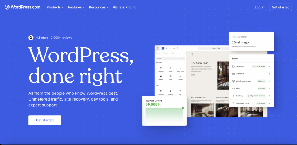
What is WordPress?
WordPress is the most widely used content management system (CMS) in the world. It powers over 40% of all websites online. With thousands of plugins and themes, you can build almost anything: blogs, e-commerce sites, membership sites, and more.
- Highly customizable
- Plugins for nearly every feature
- Requires hosting and some technical knowledge
- Perfect for scaling and SEO
✨ Tip: If you need advanced functionality, plan to scale your business, or want total control over your site, WordPress is your best bet.
Showit vs. WordPress: Key Differences
1. Ease of Use
- Showit: Extremely beginner-friendly. No code. Drag and drop.
- WordPress: More of a learning curve, but once you get it, the sky’s the limit.
👉 Tip: Ask yourself how comfortable you are with tech. If you don’t want to mess with backend settings, Showit might be easier.
2. Design Flexibility
- Showit: Complete creative freedom — move elements anywhere on the page.
- WordPress: Depends on the theme or builder you choose (like Elementor or Divi).
👉 Tip: If branding and visuals are top priority, Showit wins here.
3. Cost
- Showit: Pricing starts around $19–$34/month (hosting included).
- WordPress: The platform itself is free, but you’ll pay for hosting ($5–$20/month), themes, and premium plugins.
👉 Tip: For tight budgets, WordPress can be cheaper long-term if you manage hosting and updates yourself.
4. Blogging
- Showit: Uses WordPress for blogging, so you get the same SEO power.
- WordPress: Native blogging platform, still the best for SEO.
👉 Tip: If blogging is a big part of your strategy, both work well, but WordPress gives you more SEO tools.
5. Support & Maintenance
- Showit: Handles hosting, updates, and customer support.
- WordPress: You’re responsible for updates, backups, and security (unless you use managed hosting).
👉 Tip: If you don’t want the stress of maintenance, Showit is easier.
Which One Should You Choose?
- Choose Showit if you:
- Value creative, drag-and-drop design freedom
- Don’t want to deal with tech or coding
- Need a portfolio or personal brand website
- Choose WordPress if you:
- Need advanced features (e-commerce, memberships, custom apps)
- Plan to scale and grow your site long-term
- Are comfortable with a little tech setup or willing to hire help
Final Thoughts
Both Showit and WordPress are excellent options — but the best choice depends on your needs, budget, and comfort level with technology.
✨ Final Recap:
- Go with Showit if you want a stunning, easy-to-build site with minimal tech headaches.
- Go with WordPress if you want maximum flexibility, scalability, and control.
- Remember, you can also combine the two (using Showit for design + WordPress for blogging).
At the end of the day, your website should work for you — not the other way around. Choose the platform that aligns with your vision, and you’ll be set up for success. 🚀
READ FULL POST!
WANT MY SHOWIT DISCOUNT?
Let me give you a
14 day free trial,
plus a FREE month.
After you enter your email, you will be directed to the link where you can sign up for Showit and get your free month!
GO GET IT!

our showcase
Superhero Templates IRL
See what others have created in real life using the Superhero Showit templates


