 (1)")


 (1)")

How to Build a Showit Website That Actually Converts Visitors Into Clients
Let’s be honest—having a pretty website doesn’t always mean you’ll book more clients. You can have gorgeous colors, fonts, and layouts… but if your site isn’t strategically designed to convert, you’re basically leaving money on the table.
The good news? With Showit, you get both: total creative freedom and the ability to design a website that guides visitors to take action.
Here’s exactly how to build a Showit website that doesn’t just look amazing—but actually turns browsers into buyers.

1. Start With a Clear, Client-Focused Message
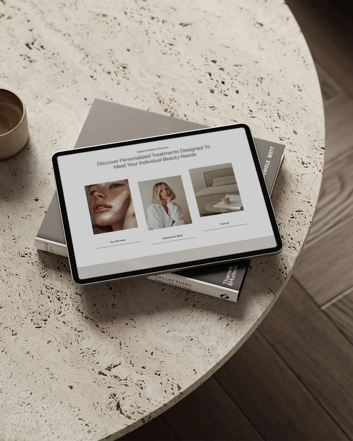
Your homepage should answer one question immediately:
👉 “How can you help me?”
Showit gives you complete freedom with text placement, so make sure your hero section includes:
- A clear headline that speaks to your client’s problem
- A short subheading with your solution
- A strong call-to-action button (like “Book a Call” or “Get Started”)
💡 Tip: Avoid making your homepage all about you. Make it about your clients and the transformation you provide.
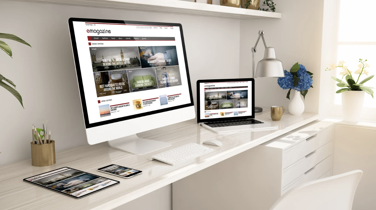
2. Design for Mobile First
Most of your traffic will come from mobile. With Showit’s unique editor, you can create a separate mobile layout—not just a squished version of desktop.
💡 Make buttons big, text readable, and keep the most important call-to-actions front and center.
3. Use Strategic Calls-to-Action (CTAs)
Don’t let people wonder what to do next. Every page should guide them to one action, whether it’s booking a discovery call, downloading a freebie, or signing up for your program.
💡 Example: Place a “Work With Me” button in your header and repeat CTAs throughout your page.
4. Showcase Social Proof
Clients want to trust you before they hire you. Use Showit’s drag-and-drop features to highlight:
- Testimonials
- Case studies
- Before-and-after stories
- Logos of brands you’ve worked with
💡 Visual proof builds credibility and encourages action.
5. Create a Simple Client Journey
Don’t overwhelm your visitor with too many pages or menu items. Instead, build a clear flow:
Homepage → About → Services → Contact/Booking
💡 With Showit, you can also create hidden landing pages for freebies or special offers to capture leads along the way.
6. Integrate Booking + Payment Tools
Instead of back-and-forth emails, embed your scheduling tool (Calendly, Acuity, or Dubsado) directly into your Showit site. Pair it with PayPal/Stripe buttons so clients can book and pay instantly.
💡 Fewer steps = higher conversions.
7. Build Authority With a Blog
Since Showit integrates seamlessly with WordPress, you get a powerful blogging engine. Use your blog to share insights, answer client questions, and improve your SEO so your ideal clients can actually find you.
8. Keep the Design Clean + Focused
Pretty design is great—but clutter kills conversions. With Showit, resist the temptation to over-design. Use white space, bold CTAs, and keep your navigation simple.
💡 Remember: less scrolling confusion = more clients clicking “Book Now.”
Your Showit website should be more than just a digital portfolio—it should be a client-converting machine. By combining strategic messaging, mobile-first design, social proof, and built-in booking systems, you can turn casual visitors into paying clients faster.
👉 Want to see exactly how to set up a high-converting coaching website inside Showit? In my next post, I’ll share a step-by-step walkthrough you can copy for your own site.

A women-owned brand and web design studio
TEMPLATES MADE FOR YOU!


Shop Showit Templates
Work With Me

Need Website From Scratch?
NEW BLOG POST
Sharing is Caring:
PREVIOUS POST
NEXT POST
MOST POPULAR POSTS
I love using this space to share a touch of website design magic along with my favorite tips. Whether you’re launching your first business or giving your online home a makeover, this is your trusted hub for design inspiration.


WANT MY SHOWIT DISCOUNT?
Let me give you a
14 day free trial,
plus a FREE month.
After you enter your email, you will be directed to the link where you can sign up for Showit and get your free month!
GO GET IT!

don't want the custom design price tag or timeline?
Shop beginner-friendly Showit templates
With a simple drag-and-drop setup and step-by-step guidance, you can skip the coding and create a site that reflects your brand. Launch in weeks with plans starting at $169!


