 (1)")


 (1)")

The 7 Must-Have Sections of Every High-Converting Showit Page
Building a beautiful Showit website is one thing. But building a Showit website that actually converts visitors into clients? That’s a whole different game.
If you’re a coach, consultant, or creative entrepreneur, your website isn’t just a digital business card—it’s a sales machine. And the way you structure each page makes all the difference.
Here are the 7 must-have sections you should never skip if you want your Showit site to work as hard as you do.

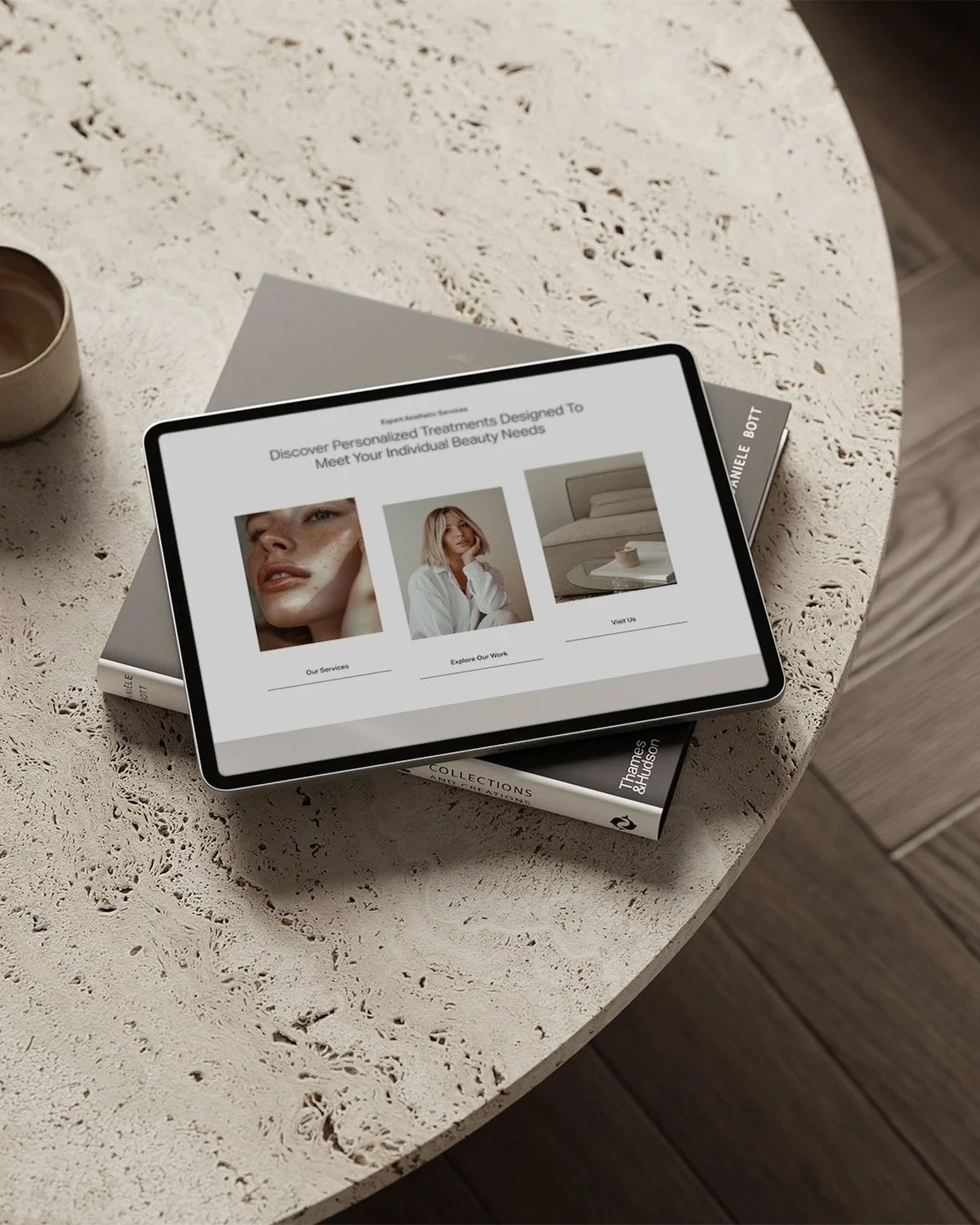
1. The Hero Section That Hooks Instantly
Your hero section is prime real estate. Within 3 seconds, your visitor should know:
- Who you are
- What you offer
- Why they should stay
Think bold headline, subtext that connects, and one strong call-to-action button.
2. The “About You” Snapshot
This isn’t your full bio. It’s a short, approachable introduction that builds trust. Share your mission, why you do what you do, and how you help people.
3. The Services Overview
Don’t bury the good stuff. Highlight your core services upfront with simple descriptions, pricing (if you want), and a clear path to learn more.
4. Social Proof & Testimonials
People buy because of trust. Adding client reviews, transformation stories, or logos of brands you’ve worked with makes your services instantly more credible.
5. A Clear Process Section
Break down your process into 3–5 easy steps. Show how working with you is straightforward and results-driven. Visitors love seeing a clear roadmap.
6. Lead Magnet / Freebie Section
Not everyone is ready to hire you on the spot. Give them an easy “yes” with a free guide, checklist, or resource that gets them onto your email list.
7. A Strong Closing Call-to-Action
Your page should never just fizzle out. End with one more chance to book a call, sign up, or connect. Use confident, action-oriented copy like:
👉 “Let’s start your transformation today.”
✨ Final Thoughts
A high-converting Showit page isn’t about being flashy—it’s about being strategic. With these 7 sections in place, your site will guide visitors naturally from curious to committed.
Don’t want to spend weeks figuring this out on your own? Need a Showit website that looks stunning and sells for you? We’ve got you covered. 🚀

A women-owned brand and web design studio
TEMPLATES MADE FOR YOU!


Shop Showit Templates
Work With Me

Need Website From Scratch?
NEW BLOG POST
Sharing is Caring:
PREVIOUS POST
NEXT POST
MOST POPULAR POSTS
I love using this space to share a touch of website design magic along with my favorite tips. Whether you’re launching your first business or giving your online home a makeover, this is your trusted hub for design inspiration.


WANT MY SHOWIT DISCOUNT?
Let me give you a
14 day free trial,
plus a FREE month.
After you enter your email, you will be directed to the link where you can sign up for Showit and get your free month!
GO GET IT!

don't want the custom design price tag or timeline?
Shop beginner-friendly Showit templates
With a simple drag-and-drop setup and step-by-step guidance, you can skip the coding and create a site that reflects your brand. Launch in weeks with plans starting at $169!


